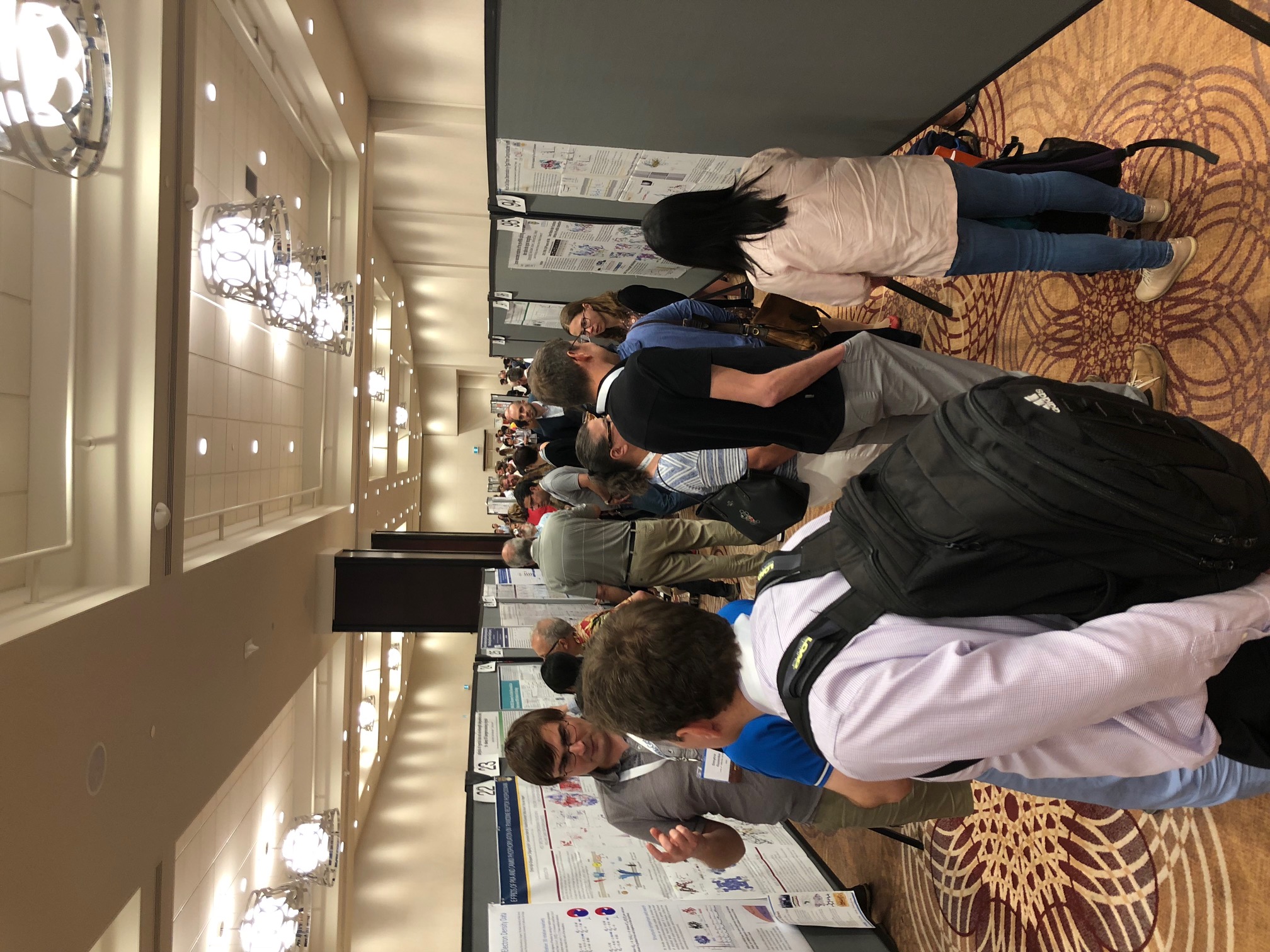
Poster Presentation
 How To Create An Impactful Scientific Poster How To Create An Impactful Scientific Poster
Compiled by Ilia Guzei (University of Wisconsin–Madison) on behalf of the American Crystallographic Association. Updated: October 7, 2016.
Preamble
If you are going to a crystallographic conference and intend to present a poster or evaluate posters, this article is for you. Even more so if you intend to compete for a poster prize. On the one hand, this article deals with poster design and content organization. On the other it teaches how to present your project in an impactful fashion and reveals how poster judges evaluate posters.
The article sections can be read in any order – they are independent and address different facets of poster business: technical aspects, philosophy behind poster content organization, oral presentation of the results, and poster evaluation.
First of all – stop! Do not begin creating your poster until you have invested 20 minutes into reading this article. It will save you much more time than 20 minutes.
Technical Aspects: Graphics & Text
Your poster will contain graphics and text. I recommend the poster layout instructions from the Makesigns Scientific Poster site. There are 11 pages of advice on font sizes, use of color and background graphics, graphics resolution, use of charts and graphs, and other considerations that one should take into account. This site is a very good starting point that removes the guesswork related to fonts and colors. You will be complimented on an easy-to-read poster. Here is a poster designed following the text size guidelines from the Makesigns Scientific Poster site.
Another site, http://colinpurrington.com/tips/poster-design provides a comprehensive review of scientific poster preparation process.
Before you start, check the conference’s guidelines to find out the size and orientation of the posters and poster boards and any recommended font sizes, etc. Then follow the guidelines!
Tools
You can’t go wrong with Microsoft PowerPoint or Adobe Photoshop for creating your poster. Jens Luebben (University of Goettingen) and Blaine Mooers (the University of Oklahoma) shared the following list of alternative products.
Scribus is a very nice cross-platform open source publishing software. It supports color palettes and, as a unique feature, allows to render text boxes with Latex from within the application. This way you get beautiful typesetting without the static layouts that Latex usually enforces. Price: free.
GIMP is an open source Photoshop clone. Whenever pixel graphics are involved, GIMP is the right program. Not only useful for posters. Price: free.
Inkscape is the vector graphics equivalent to GIMP. Price: free.
Blender is an open source 3D modeling and rendering software. It has a very steep learning curve (don't try to use it without watching tutorials) but is very powerful and helps to create amazing visual elements for a poster. Just think about molecules made of glass casting shadows on the ground or green glowing Uranium atoms illuminating the rest of the cell. Price: free.
PyMOL is a nice tool for creating images. Whereas the educational version of PyMOL has some crippled features, the open source version available from sourceforge is essentially fully functional and free. Binaries of the open source version are also available through various software repositories (e.g., fink, homebrew and macports on the Mac). Information about installing the open source PyMOL on three major operating systems is available.
Respectable alternatives to PyMOL are Chimera, CCP4MG, VMD, and JMOL. Some users of PyMOL meet their molecular graphics needs by relying on the options available in the GUI and by saving their intermediate work with session files. Other users make scripts to reproduce their molecular scenes and make further improvements. Sample scripts are available at the PyMOLwiki and the EasyPyMOL GitHub site.
Plotting data well is an acquired skill. Generally it is best to pick one plotting program and then really master it. Proprietary program Origin can be used for data presentation. Excellent solutions can be found in the free open-source programs gnuplot and the matplotlib and ggplot modules in Python. If you are not a programmer, the powerful Grace has a GUI interface.
A crystallographer's arsenal includes free Platon (a very nice tool for creating vector graphics of anisotropic ADPs), OLEX2, Mercury, POV-Ray, ORTEP-3 and (paid license) Diamond for molecular graphics.
General Poster Design Recommendations
The poster serves as a way to "show" what you did with pictures, plots, and minimal text while you get to "tell" the story of the investigation weaving all of these pieces together.
The title should be short and catchy, but not gimmicky. It should not contain chemical names.
Your poster should contain a minimal amount of text. The poster does not need to provide ALL the details. A non-expert should be able to read your poster in under 5 minutes. This is the number one comment by poster judges and authors of winning posters. Whereas it is difficult to curate yourself and truncate valuable paragraphs – do it! The key is to make your poster interesting enough to motivate the reader to come to the poster session and talk to you, the author. Then you will be able to elaborate on your ideas.
The layout should be logical and easy to follow, perhaps with frames. There should be a flow to the poster: at the minimum there should be a (brief) Introduction, Experimental section and Results (these two are the meat of the poster), and Conclusions. If the Conclusions suggest further work, mention this briefly. Do not provide an abstract – the title suffices.
Posters are a great opportunity to use color effectively to attract attention, but you can overdo it! Choose a color palette. You should have a color scheme that means something and use it consistently. It's literally ten seconds of work if you do that at the beginning and it can turn a poster from a chaotic mess into a beautiful composition. Every layout program has tools for that and if not, the Internet can help: http://paletton.com/ is great for that purpose. Because red-green color blindness affects a significant number of people, try to avoid using these colors next to each other, for example for adjacent slices in a pie chart. Yellow can be a “weak” color that is unsuitable for thin outlines and lines on a graph. Do not use gradients if you don't make your image backgrounds transparent. White boxes on top of a gradient look weird.
Break up the layout somehow. Many posters use flat rectangular text/image boxes. These boxes are helpful for organizing the content but also make the content feel static. Consider rounding the box corners or cutting off a corner of a box here and there. Let an image 'grow' over the box border into another box or let the box with the most important content overlap the other boxes a little bit.
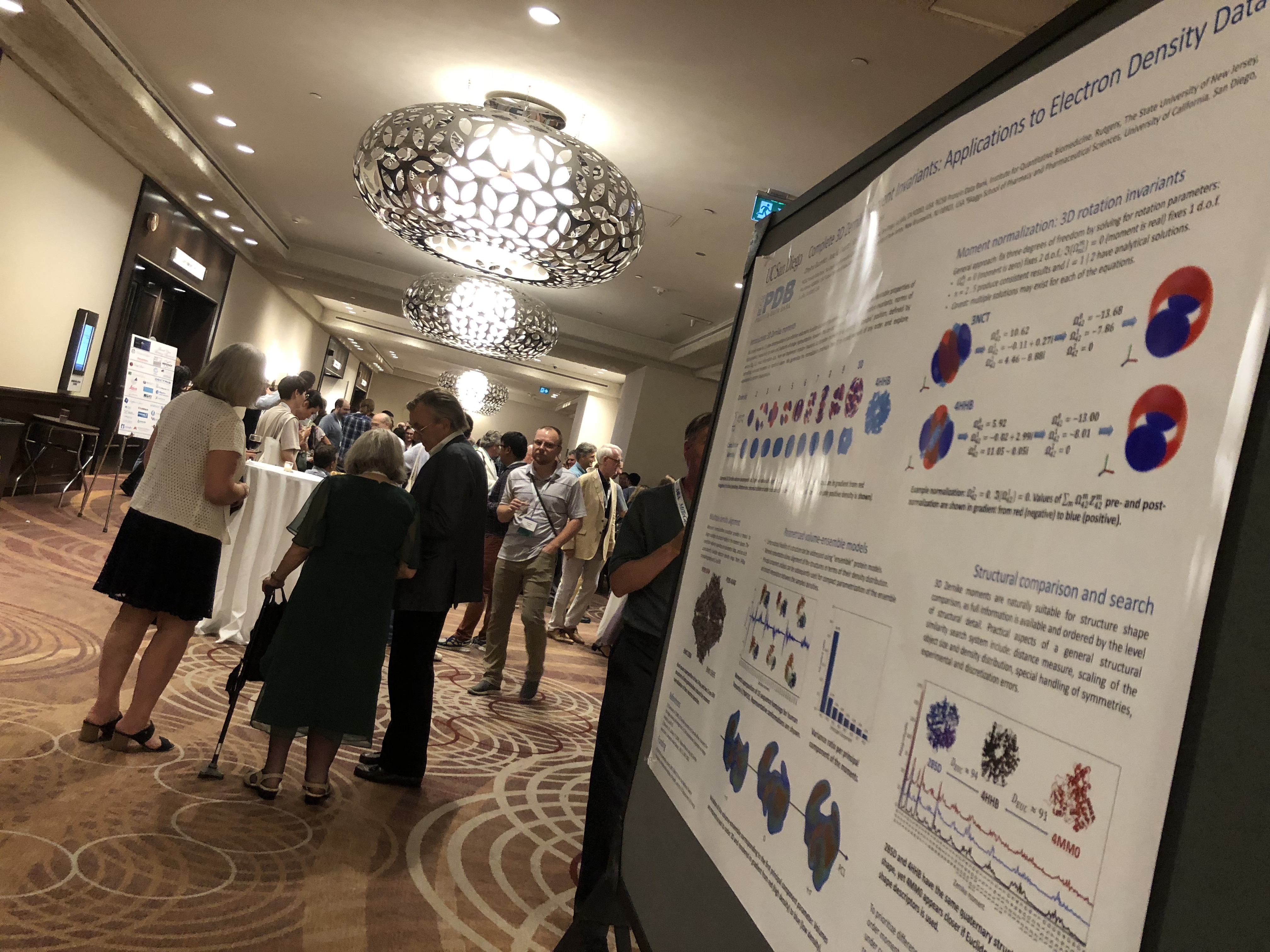
A picture is worth a thousand data points. Figures are obviously important but they must have high information content and be of high quality, resolution, and relevance, with all essential details clearly visible. The requirements for lettering size on figures are the same as those for the running text. Figures should be numbered and called out in the text. Avoid references a la “the Figure below”, because the Figure might be at the top of the next column. All figures should have complete, self-contained legends.
If you use boxes or panels, make the purpose or take-home message of each panel very clear, perhaps as a title of the panel. A good rule of thumb is “one idea per panel, one idea per sentence”. Avoid boxes of lengthy text.
Keep the text portions of the poster short – nobody wants to read paragraphs. Bullet points work well on posters. People can grasp the bullet points while passing by. Then you grab the people.
General Content Recommendations
Know your audience. For example, if you are making a poster for an ACA conference you should certainly include crystallographic data and results on your poster, if you have any. Explain the diffraction limit of the crystals, show electron density for ligands or representative electron density for the macromolecule. Scientists love to look at data and interpret those data for themselves! No crystallography means low score by most judges.
To avoid producing material you don’t need, first prepare an outline of what you are going to present. The selection of content is vital: only the information necessary should be included. Space is limited, so absolutely avoid duplication (e.g., between text and Tables).
The poster should be “self-contained”, i.e., it should present a complete story that can be understood and appreciated without the need for intervention by the presenter. It should not assume an unrealistic level of prior knowledge (the appropriate level may depend on whether the conference a specialized or a general one).
A poster is not a journal article, there is no need to reveal your results at the top of the poster. Make the problem sound really interesting at the beginning and reward people who read through your poster.
The information on the poster must obviously be clearly expressed and accurate. Errors in spelling or grammar will be painfully obvious on a poster, so double-check and get someone else to proof-read the poster as well.
Oral Presentation Of Your Poster
“Soft skills” is one of the current catch phrases, and communication skills may be the most important soft skill. Have you heard of the “three-minute thesis”? That is where a graduate student presents his or her thesis research in three minutes. Be ready to explain your poster in three minutes, or 10 minutes, or 20 minutes. However, if you start on your 20-minute explanation, leave opportunities for the audience to ask questions that you answer. Make sure you have a story to tell, one that starts with an introduction, then experiment, then results. Don’t start with the results during your presentation.
Here are five questions you should be able to answer easily:
1. What is my poster presentation about?
2. Why am I doing this and what do I hope to add to this field of research?
3. What were the methods I used?
4. What conclusions did I come to from the data I collected?
5. What are my recommendations based on this research?
You should be giving a rehearsed rather than memorized talk. Rehearsing will allow you to recall your material quickly. If you start assembling your talk at the outset of your poster session you may come across as unprepared.
Posters give the opportunity to have a discussion with the audience. A very productive approach to initiate a discussion is by asking the visitor to your poster "What brings you to my poster?" or "What is your area of expertise?", even if the visitor is a judge. Armed with the knowledge of your audience you can tailor the amount of detail or background information that the visitor would need to fully appreciate the value of the project. Don't be surprised if the visitor is stunned by such a question or does not have a good answer.
Make sure you can discuss all the points raised on your poster. Is there any supporting information you could refer to? If so, it’s a good idea to have it at hand.
Be enthusiastic when speaking about your work – if you don’t appear excited about your research, why should anyone else be?
Don't forget to bring your business cards. (A graduate student with a current business card comes across as thoughtful and professional). Also consider having 8x11 printouts of your poster (with highlights of your poster presentation on the verso page) to hand out.
What The Poster Judges Evaluate
The poster will serve as a great visual aid to your narrative. Nobody knows your project better than you do, but being able to explain it clearly is a skill. It helps to crystallize the general ideas into answers to concrete questions. For example, Emeritus Prof. John R Helliwell (University of Manchester) asks presenters a standard set of questions:
1. What were your aims and selected method/approach to tackle them?
2. What are your findings?
3. What is your research plan to build on your findings?
4. What are your possible societal impacts?
These questions blend an assessment of working in a team with a chance to document the presenter's originality.
Guidelines For Poster Evaluations
For years I have asked my judges to use the following guidelines when evaluating posters.
• Presenter must qualify for the prize.
• The work must be original.
• Presenter must have done a substantial (majority) portion of the research presented.
• Presenter must understand the research on the poster.
• Presenter must be able to explain the poster.
• If presenter is absent – revisit the poster later.
• Identify yourself as a poster judge, either before or after talking to the presenter. (Some judges like “flying under the radar”, but in the end they have to reveal their function to the presenter. It is important for a poster prize contender to know her/his poster has been evaluated.)
• Consider nominating runner-ups for honorable mention.
Final Thoughts
The technical information and advice presented herein is illustrated with a paraphrased quote from a poster prize winner Joseph Chappell (Western Kentucky University): “I was fortunate to speak to one of the judges after I won the IUCr poster prize award at an American Crystallographic Association conference. She said that the major reason I was chosen was because my poster design was neat and not over crowded with information, just the important details someone would need to see if they were viewing my poster on their own. Another major reason was that I was able to easily and concisely explain my research to the judges without stumbling over words or phrases. Prior to creating the poster, I did a Google search on what makes good poster designs and outlines. I found that many people recommended keeping posters neat and clean and not trying to cram as much information as possible onto your poster. I followed this advice and lo and behold it worked. My adviser at the time also highly recommended that I split the poster into three columns that flowed left to right. This made the poster easier to read and more pleasing to the eyes.”
Should you decide to compete for a poster prize make sure you (a) qualify for the prize, (b) the prize matches your research, and (c) you select the prize you actually want (like book or money) in case your poster is eligible in more than one category. On average, the chances of winning a poster prize at an ACA annual meeting is 1 in 6.
Contributors
Ilia Guzei (University of Wisconsin-Madison) served as the Poster Chair at the annual American Crystallographic Association meetings between 2011-2016.
This article is a collage of contributions from the following colleagues.
The author is thankful to all of them. In alphabetical order:
Alexander Blake, The University of Nottingham
Ayaka Harada, The Grad. Univ. for Advanced Studies, School of High Energy Accelerator Science
Blaine Mooers, University of Oklahoma
Brian Dolinar, Texas A&M
Christine Beavers, Lawrence Berkeley National Lab
Darpan Aulakh, Clarkson University
David Rose, University of Waterloo
Elizabeth Goldsmith, UT Southwestern
Emilia Arturo, Drexel University
Francis Salemme, Imiplex LLC, Bristol
Jens Luebben, University of Goettingen
Jinhong Hu, University of Calgary
John Helliwell, University of Manchester
John Rose, University of Georgia
Joseph Chappell, Western Kentucky University
Juby Varghese, Clarkson University
Kristin Kirschbaum, University of Toledo
Louise Dawe, Wilfrid Laurier University
Marie Elizabeth Fraser, University of Calgary
Marilyn Olmstead, UC Davis,
Nara Guimarães, University of São Paulo – USP
Nikoletta B. Báthori, Cape Peninsula University of Technology
Warren Wakarchuk, Ryerson University
|